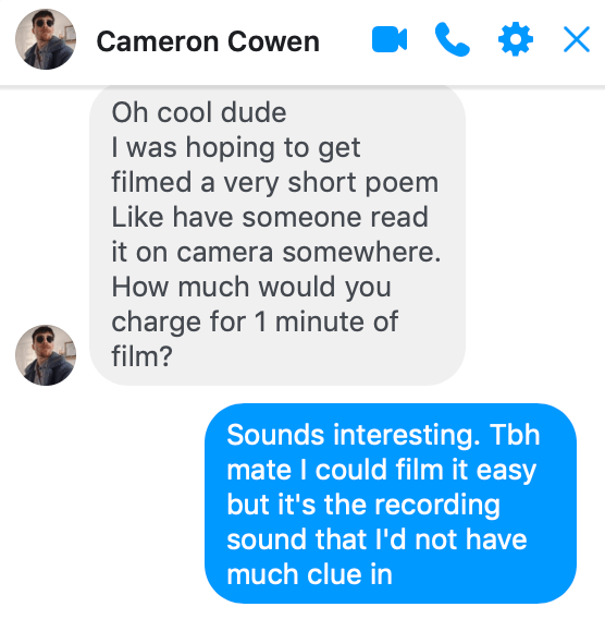
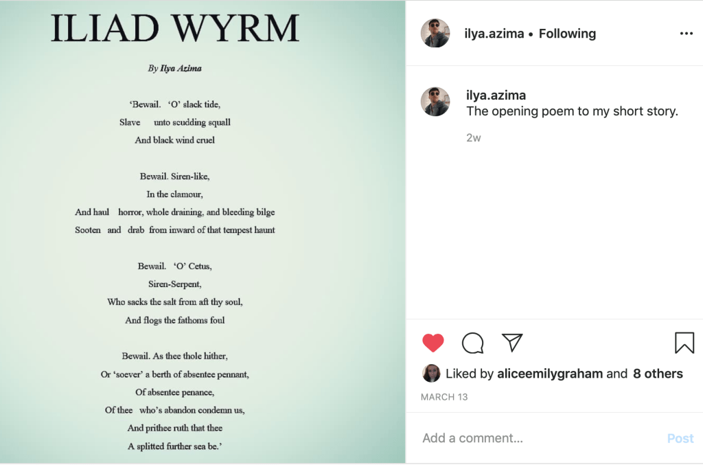
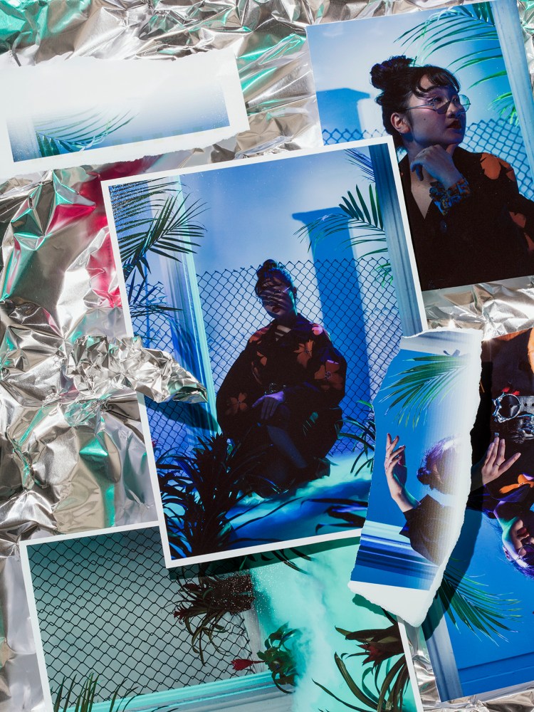
I was approached by Cameron Cowen (AKA Ilya Azima), a creative writer who wanted me to help in making a short film to accompany the opening poem ‘ILIAD WYRM’ to his short story. I was ready to have a creative input and was excited by the aesthetic he wanted; “saturated colours, high noise, 70s style”.
Although was worried about my lack of experience with film, I could use my existing camera knowledge and educate myself more by talking to film-students and online resources. Cameron assured me he has sound equipment that he knew how to use, which was my main concern as I have no experience with sound beyond holding a boom pole.
We scheduled to meet during the Easter Holidays to plan and shoot, however, due to the government-issued lockdown we continue to plan and exchange ideas online and have postponed the shoot to the Summer Holidays.
‘ILIAD WYRM’ is about the sea, but it also represents limbo. “Iliad” is originally the name for the Ancient Greek poem depicts disputes between King Agamemnon and Achilles during the Trojan War. While the word “wyrm” is associated with being a dragon-like mythological creature. This imagery of conflict and the movement of mythological serpents is reflected in the flow of the poem and the theme of the sea.
This job has been postponed from Easter until Summer due to the Covid-19 outbreak and consequent lockdown.
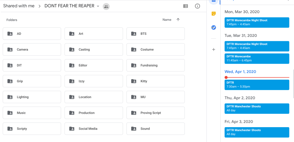
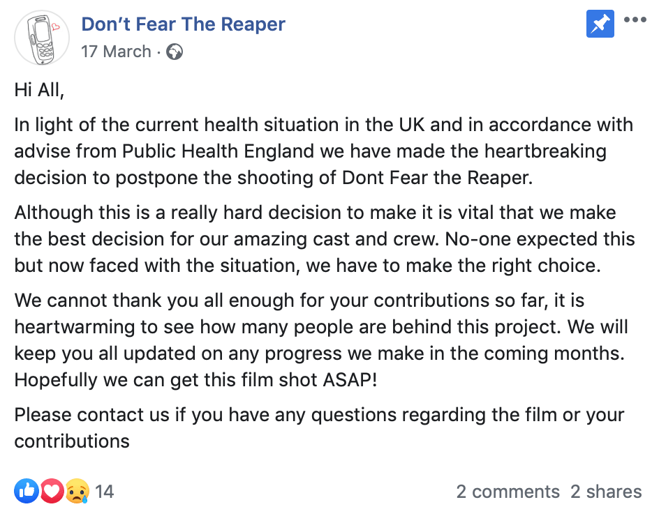
I was invited to be the behind the scenes photographer at a film student’s FMP for their Morecambe shoot, perhaps doubling my role up to be a runner as well. I love the premise for the film Don’t Fear the Reaper it is a love story with a fantasy element which really appeals to me. I also like that it stars a gay couple but isn’t focused solely on them being gay – its approach as any other romance.
FILM SYNOPSIS:
Ellis is a grim reaper, who wanders the world unseen by people until they die and he has to move their soul to the afterlife. In his spare time, he watches a human man named Will who is full of life, whereas Ellis has no emotions. When Ellis has to reap Will’s soul, he decides to take him on a date rather than take his soul. However, the new emotions Ellis starts to feel breaks down his body.
I’ve worked with the director Izzy Pye before and assisted her on some of her shoots, which has always been a positive experience and I’ve come away learning new skills. I love all the films she has made, whether directed or written or both – she has a unique creative writing style that is relatable for young people today and the her films are executed well visually too.
I am mostly anxious about working with a full film crew because I am first and foremost a creative photographer. My technical knowledge is quite basic in that I know how to use camera settings and light to my advantage, but I will be working with camera ops and cinematographers in their final year of university and I don’t want my skills to be doubted or for there to be miscommunication or hold-ups because I don’t understand all the camera/filming jargon. I will have to research this, and I plan on talking to the Photography and Filmmaking Resource Team at the university for advice and insight on BTS photography and camera equipment.
I will be based in the Unit DIT station for SD cards. This aspect of keeping all the footage and photographs is what is making me most apprehensive because I’ve never worked in a crew this large, and I don’t want to slow down or distract anyone because I am unsure what to do. I guess the best approach is to research and prepare as much before hand then be open and communicate well during the shoot. No doubt I will make many mistakes but I have to remind myself it is a great learning experience.
Monday 30th March: Night shoot 7:30pm-5am
Tuesday 31st March: Day shoot 12pm-6pm
Wednesday 1st April: Day shoot 7:30am-5:30pm
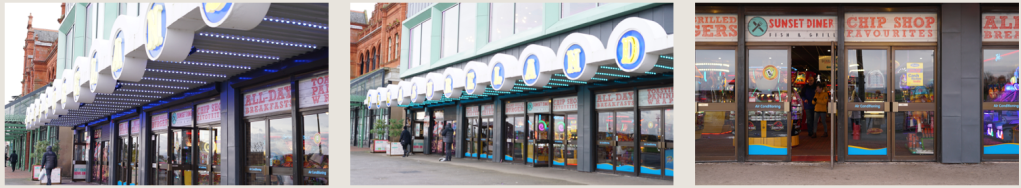
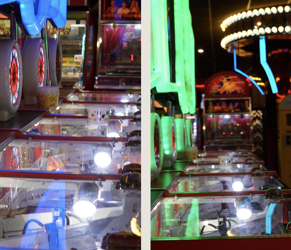
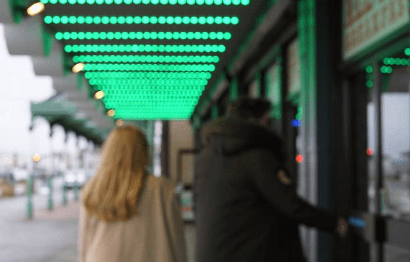
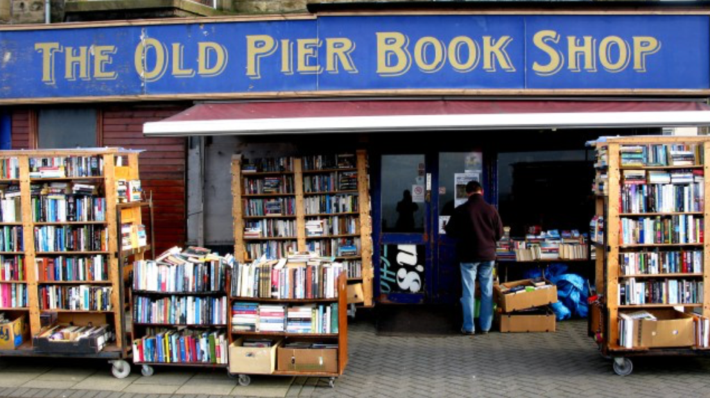
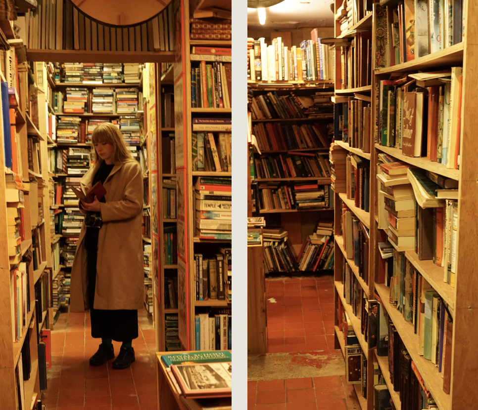
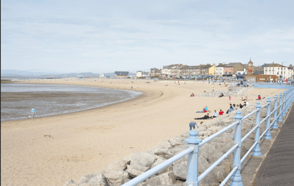
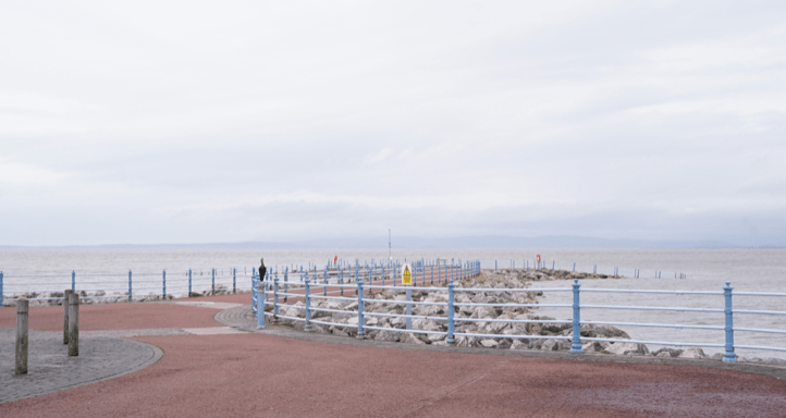
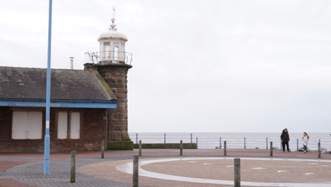
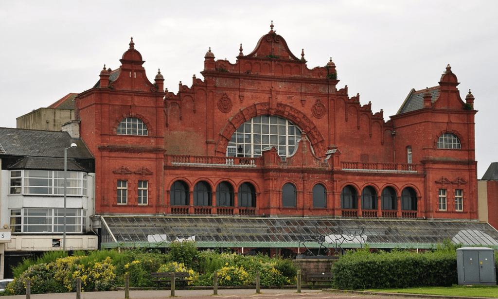
I do have the advantage of being very familiar with the locations we will be shooting at and may be helpful in that aspect, as most of the crew will never have been to Morecambe before. It is in lovely locations on Morecambe seafront and I am excited to shoot the uniquely beautiful but run-down places: arcade, bookshop, beach, stone jetty, Winter Gardens and the old Lido
THIS PROJECT HAS BEEN POSTPONED UNTIL THE END OF SEPTEMBER 2020 DUE TO THE CORONAVIRUS PANDEMIC LOCKDOWN
David Brandon Geeting presented and spoke about his work on Google Meet, as everyone is currently social distancing. I really like his unique and quirky style of photography.
He mentioned only learning about work that he finds visually interesting, which I can agree with to an extent, but I do believe its important to at least glance at the intentions of the artist to understand and perhaps appreciate the work, rather than dismissing it completely based on its aesthetic appeal.
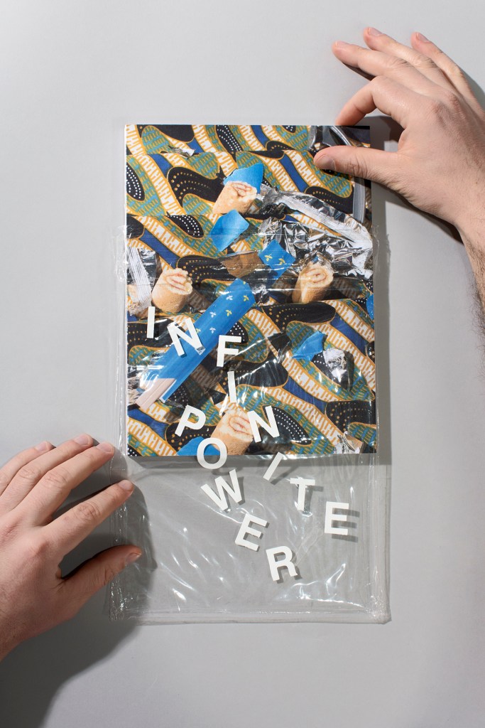
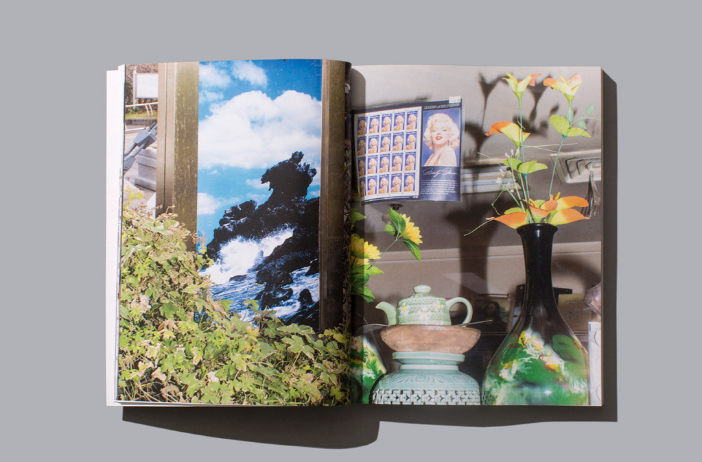
‘Infinite Power’ was Geeting’s first published photo book. A book of still life photographs composed with stuff Geeting had easy access to; “trash” and “stuff from the dollar store”. His motivation for this series was as a way to exercise his brain to creatively composition regular objects in a cool way.
I like the presentation and design of the photo book, especially printing the title onto the cover plastic, which is something I haven’t seen before and encourages the owner of the book to preserve the book within the plastic as by titling it, it has become a vital part of the book.
Infinite Power
Brandon Geeting likes to compose most of his shots in camera, with little to no post-production, unless it is an intended part of the work. A signature style of his work is to take a photograph, print it, then photograph it again within another shot. He does this for both personal and commissioned work.
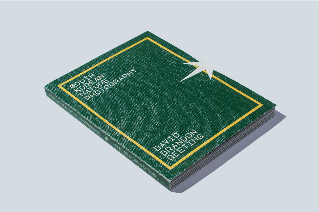
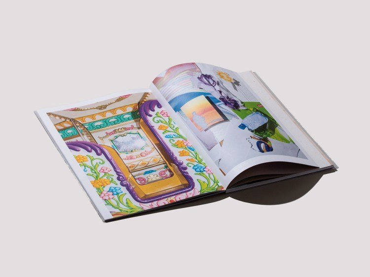
‘South Korea Nature Photography’ – admittedly this photo book interested me less than Geeting’s other work. I appreciate the creative thought gone into framing the shots using what was readily available in South Korea, and I do like the images, they just didn’t hold my attention as much as his other work he presented to the group.
South Korean Nature Photography
Geeting favours using speed lights snd Nikon DSLRs.
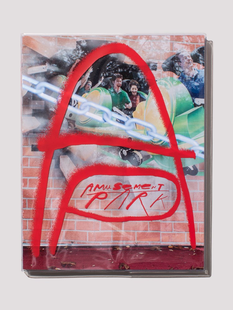
‘Amusement Park’ is a photo book intended as a series of “strange”, “off kilter” images with “precarious compositions”. I like the playfulness of these photographs and the nostalgic aesthetic paired with the retrospective gaze that sees the garish instead of the wonder that appealed to us as kids.
David Geeting jokingly encouraged us to go out with fabric as he did and use it in outdoor environments as he did with playground equipment. I do particularly like his photographs with fabric on playground equipment; they are very odd due to the opposite colours and textures associated with the rich quality fabric and the blunt boldness of the plastic and metal playground frames. I also find them claustrophobic because children’s climbing frames are usually outside in the open. The slide covered with golden shiny fabric looks as if its about to burst as its bulging through the gap, which makes me feel anxious looking at it.
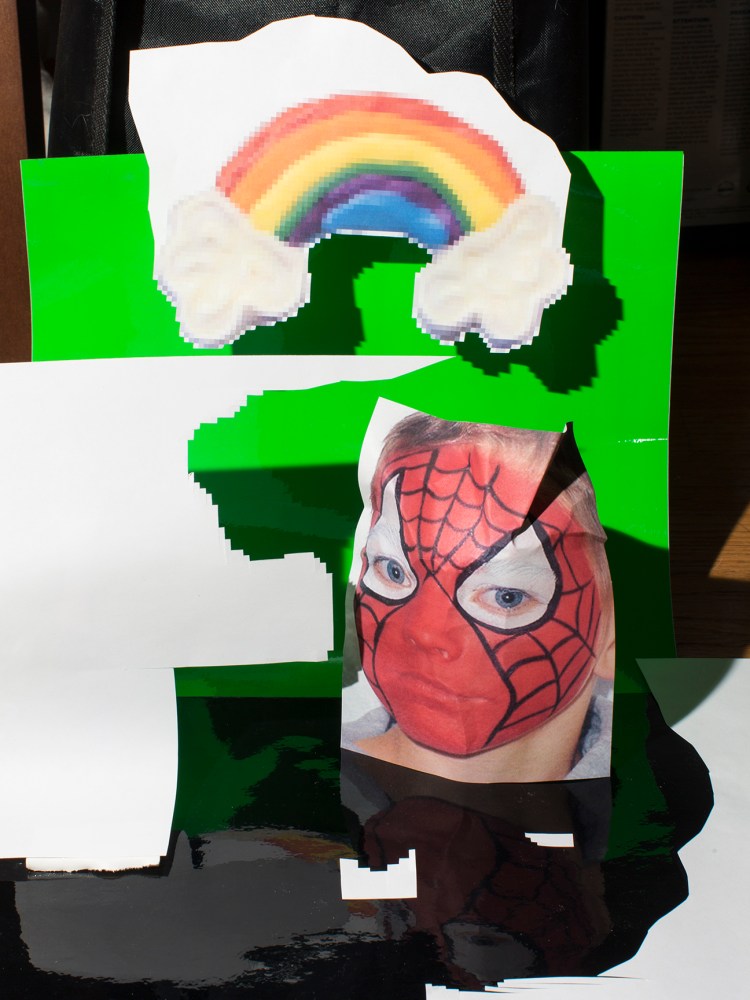
I honestly hate the image that has been put together in post-production, with the pixelated random edges, the green-screen green, the harshness of the photograph of the boy in Spiderman face paint, the glitchy-ness of the entire image. Although the style and imagery used does evoke unwanted nostalgia, probably the tackiness and poor digital design I associate with growing up in the early 2000s. I can appreciate the strong reaction Geeting evoked from me with this image, but visually speaking I despise it.
Amusement Park
David Geeting explained how the meaning of a photograph shifts with how you look at it, and how you sequence it (in a book or in a gallery). This changes how the story shown is perceived whether it is true, untrue or purely aesthetic.
Geeting uses local printing shop to publish his own photo books for about $10 per copy.
He is inspired by the mundane and ordinary as it is all he knew growing up (Pennsylvania)
Geeting advised that clients hire you based on your style. They see that photographing things in your style is what you are best at.
“Photograph things you’re used to or bored of as if you’re seeing them for the first time”
Roz Doherty from the Leeds branch of The Miniclick Photo Talks visited our course group to tell us about herself and Miniclick. Roz herself is a photographer and studied photography part time at Bradford College for 6 years. She explained that Miniclick is run off “love of labour”, and that her full time job paid her bills.
Miniclick is curated by 11 people: Jim Stephenson, Lou Miller, Bryony Good, Roz Doherty, Lauren Holder, Marta Benavides, Livia Smith, Kristina Salgvik, and Joe Conway and has bases in Brighton, London and Leeds. They are involved in Brighton Biennial Fringe, Look Liverpool, Photo North Festival.
The aim of Miniclick is to offer open and accessible talks/discussions on photography; focusing on stories and ideas instead of kit and cameras. I’ve been to a miniclick talk event before at the Brunswick in Leeds – crime & punishment with Pete Brook and Roxana Allison. I really enjoyed it and the focus of ideas being communicated by photography really appealled to me, as the usual photography groups have paid memberships to compare kit, which I’ve always found a bit elitist, boring and not worth paying for.
ELYSE EMDUR – PRISON OBSCURA
ROXANNA ALLISON – OPERATION JURASSIC
I would definitely attend more talks run by Miniclick because it introduces me to new ideas and how artists approach issues/briefs differently. It would also be a good way to network within the creative industry and to build my confidence when meeting new people and getting involved in topical conversations and observations.
Roz Doherty also gave examples of how people who weren’t artists or photographers came to the photo talks – such as people interested in the paranormal when they had a talk event on Paranormal Photography. I think this is cool because it brings people together than may have not met otherwise to discuss ideas, make friends and even collaborate on projects of shared interests.
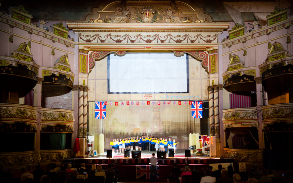
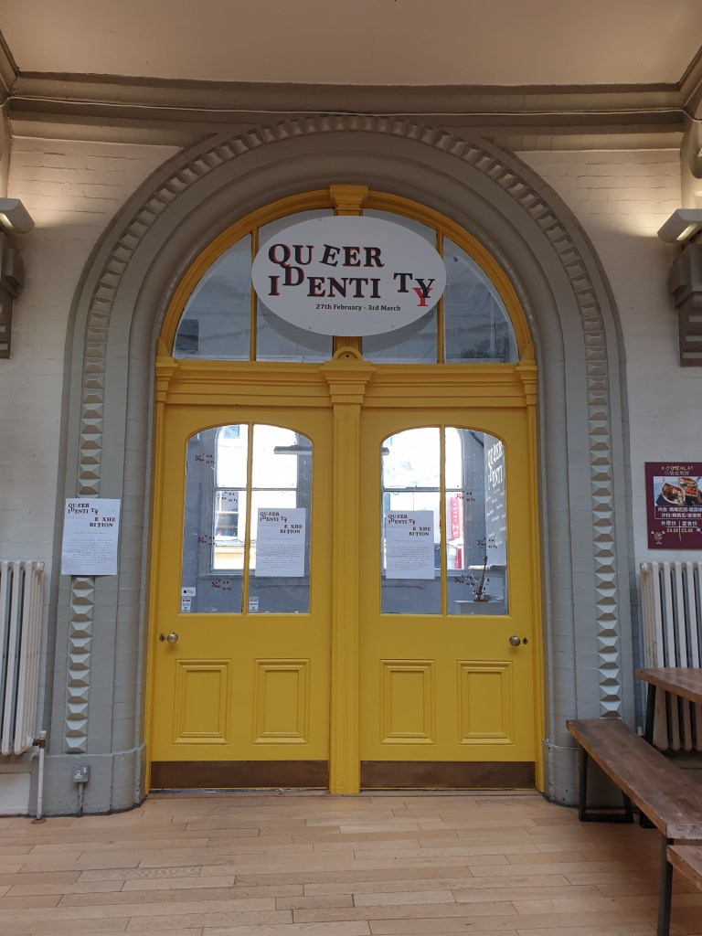
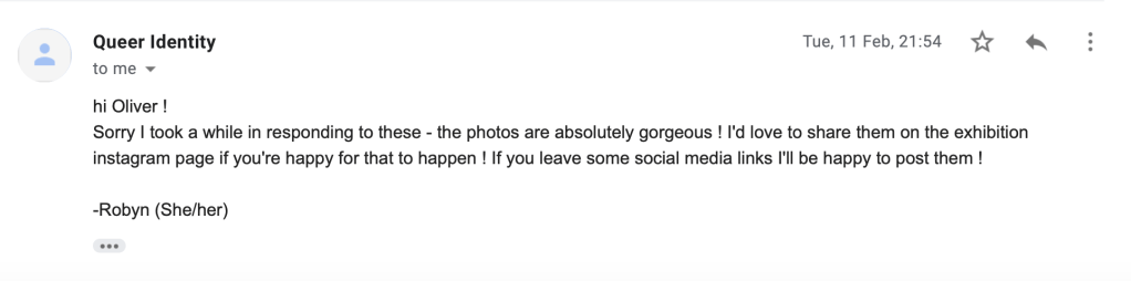
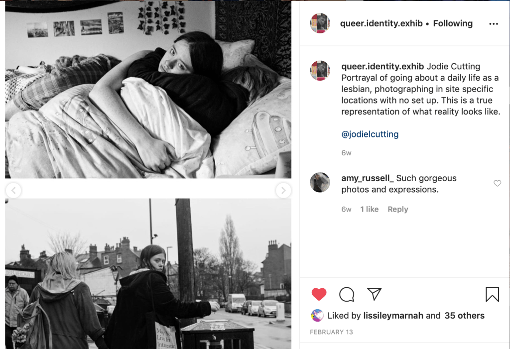
I submitted three photographs from a series I have been working on since summer 2019 to an open submission for ‘QUEER IDENTITY’. This exhibition was organised by Robyn Dewhurst (Level 6 Photography, Leader of LAU LGBT+ Society). Unfortunatley I missed out on putting up the exhibtion and opening night due to clashes with my trip to Budapest. But I worked with Robyn and the union put up my work for me, which I am very very grateful for.
Through this exhibiton I have gotten positive feedback from a couple of people, and connected with other queer artists through social media. Although, from seeing my work printed and hung, I felt it was very minimal, which works for on screen but I learnt that when physically exhibited I needed to add more photographs from the series to make it more substandtial and display it on bigger scale prints. If exhbited again I would include more photographs and present it differently to communicate more of a clear narrative, as it reflects a documentation of a journey of recovery from top surgery of a transgender man.
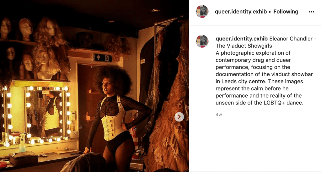
It was amazing that the public got to see my work in such a central place as Leeds Corn Exchange, and that I was able to discover other amazing artists from the university that I otherwise may have not met. I particulary find the students that use photography in their pracitce very inspiring such as Robyn Dewhurst, Jodie Cutting, Jack Cunningham and Eleanor Chandler.
This small body of photographs is a documentative portrait of a transgender man who underwent top surgery last year. Although he wishes to remain anonymous, he feels much more at peace with himself and more comfortable to express his queer identity. This body of work is intended to communicate a peaceful recovery and reflective state, and to normalise a trans body in a positive light.
I was so pleased to see my work mentioned in the exhibition review on the Baby Step Magazine website! I’m glad they liked my photographs and that they understood my intentions with linking the images using natural textures (the grass).
I agree with their one criticism of the exhibition being lack of written detail paired with the works. Although it was available in the leaflets, they ran out quickly. I think it would have been beneficial for the text to be paired clearly with each piece for the benefit of people new to analysing art pieces and people uneducated about the queer subject matter of each piece.
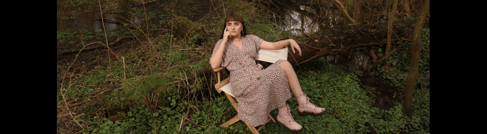
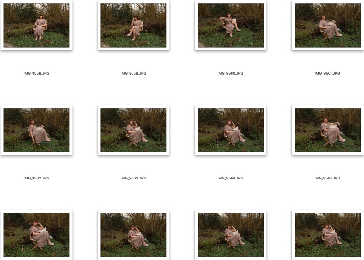
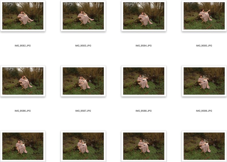
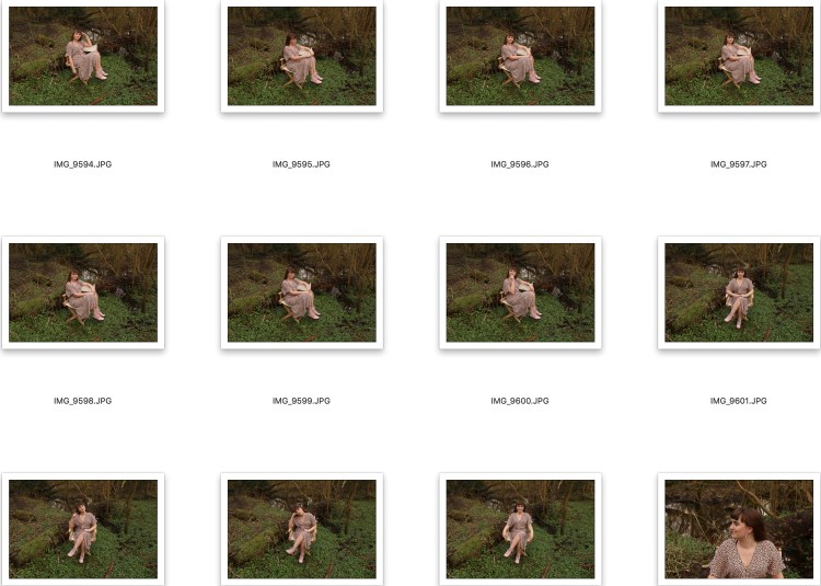
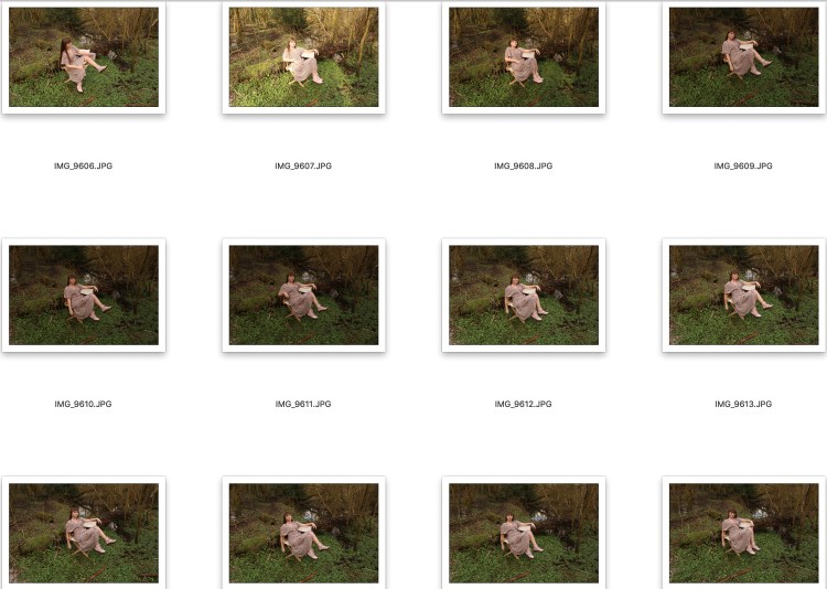
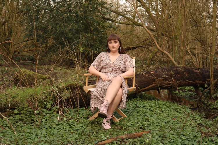
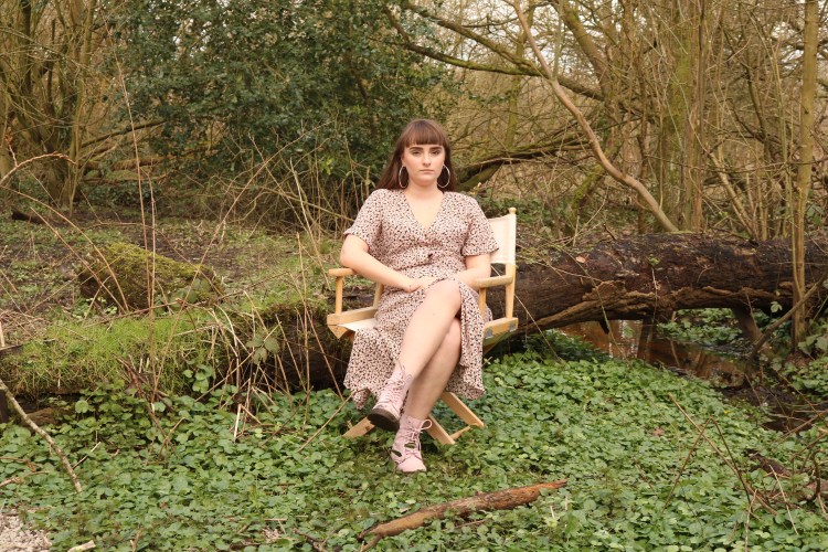
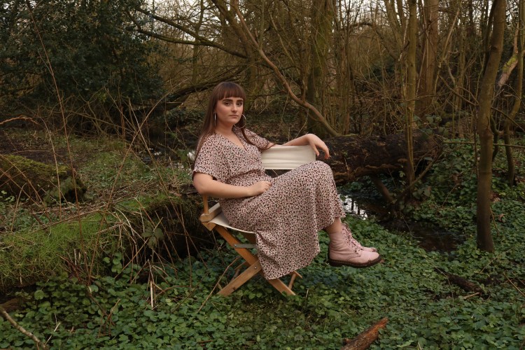
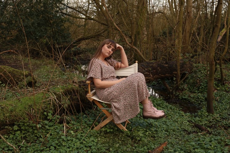
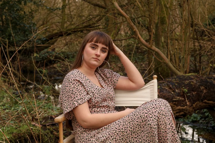
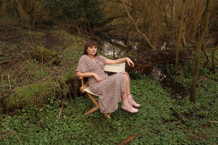
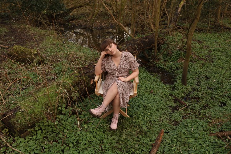
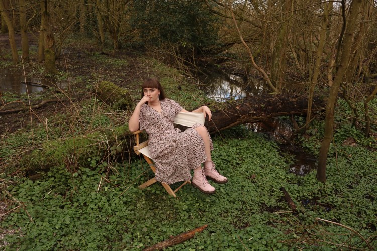
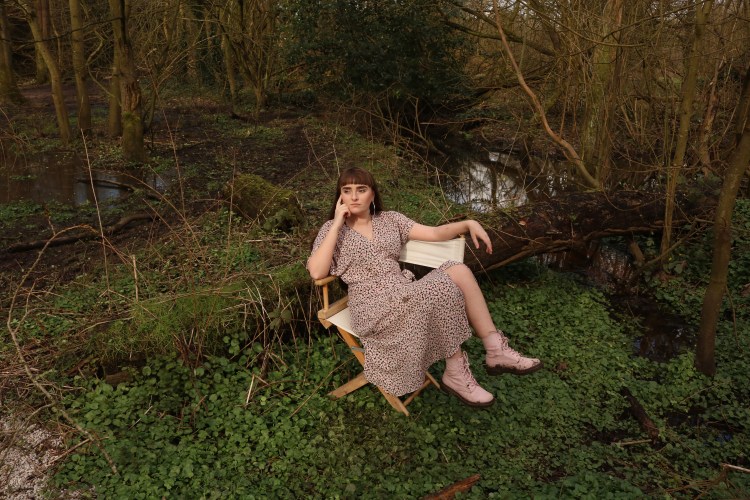
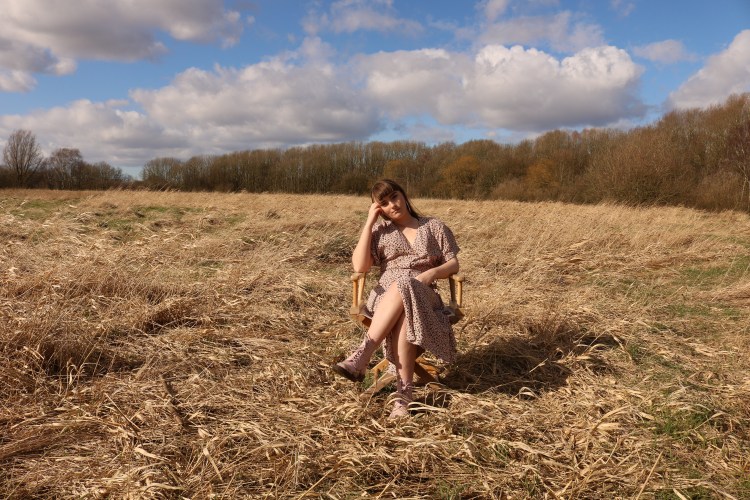
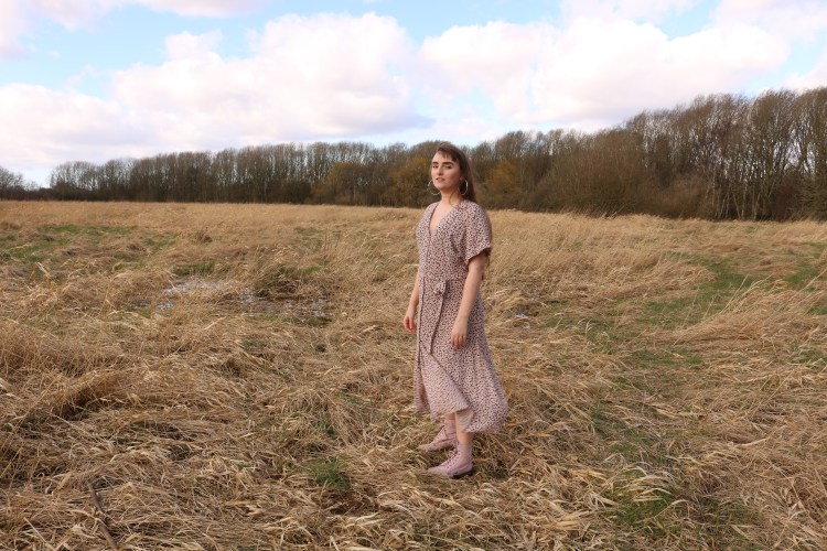
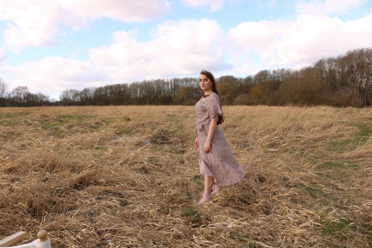
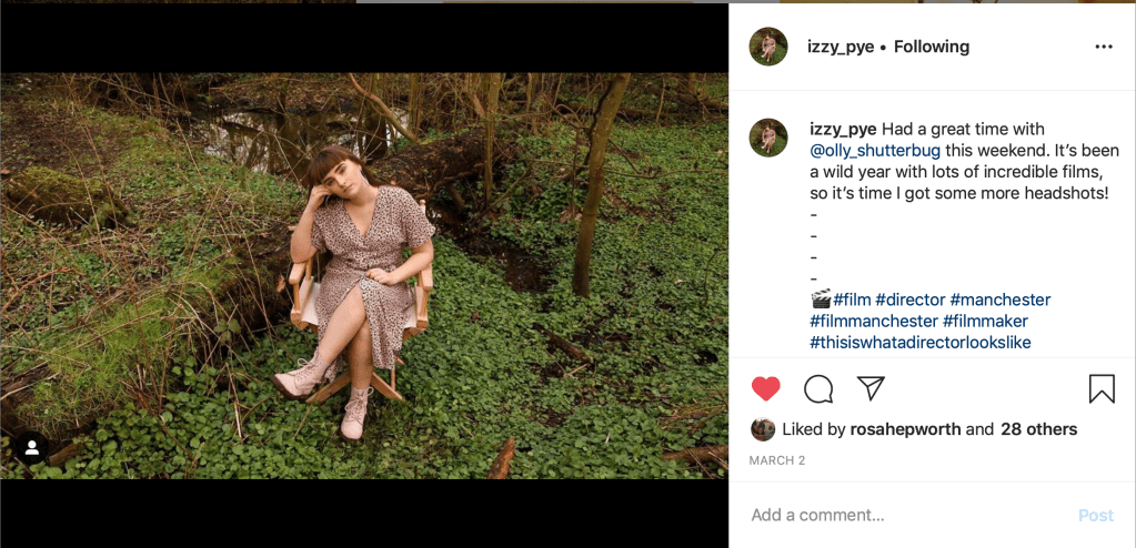
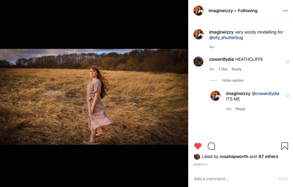
I collaborated with film student Izzy Pye to shoot her headshots for her personal professional practice and use on her social media accounts and website. Talked before the shoot and sketched out some ideas for a creative composition – more than just a standard portrait headshot.
We shot in the rural part of a park with a directors chair as the main prop. It was a bright day but there were cloudy spots where I had to adapt my camera settings. It was a little difficult at times to work without an assistant; positioning a light reflector on trees and rocks and going back and forth to adjust it was a little time consuming. But overall the images came out quite well with only a few dark spots and imperfections that I fixed with Adobe Photoshop in post.
It was fun to work in a natural environment, it looks really nice and visually interesting – its a bit different but I had to take advantage of such a beautiful location on a bright day. When directing her how to stand or sit I mostly went by where the light was then by what was most flattering. Then I moved with the camera to frame the shot. This is because the light was out of my control when shooting on location using natural light and reflectors.
After the shoot we edited the photographs together, picking which we thought looked best, and I fixed patches of light and noticeable imperfections in Photoshop. Later I gave her the exported jpeg files to use as she wished.
I was unbelievably excited to visit Budapest, Hungary, because I haven’t been to Eastern Europe before, or much of any of anywhere outside the UK for that matter. I love the idea of travelling, learning new things, experiencing new cultures and documenting my experience through photography. For years I’ve found myself envious of those travel photographers on Instagram but now I was finally going to a beautiful city I’ve been wanting to visit.
Other than learning basic phrases in Hungarian and bringing all my SD cards I didn’t do much to prepare for the trip. I wish I had borrowed equipment from the uni camera shop such as a Pentax 1000 SLR and some different lenses. I only brought my own camera and standard lens which was sufficient enough.
LANDSCAPE PHOTOGRAPHY
Shooting landscape shots was when I most wished for a different lens – perhaps a telephoto lens so I could get the composition I desired while keeping the majority of the image sharp. I’m not well practised when it comes to landscape photogrpahy, in terms of the technical aspect of getting a good quality image. It was a little frustrating to be faced with beautful landscapes and not be able to achieve the photo I envisioned. Although landscapes aren’t something I really want to pursue, it is definitely a big gap in my knowledge that I want to fill.
STREET PHOTOGRAPHY
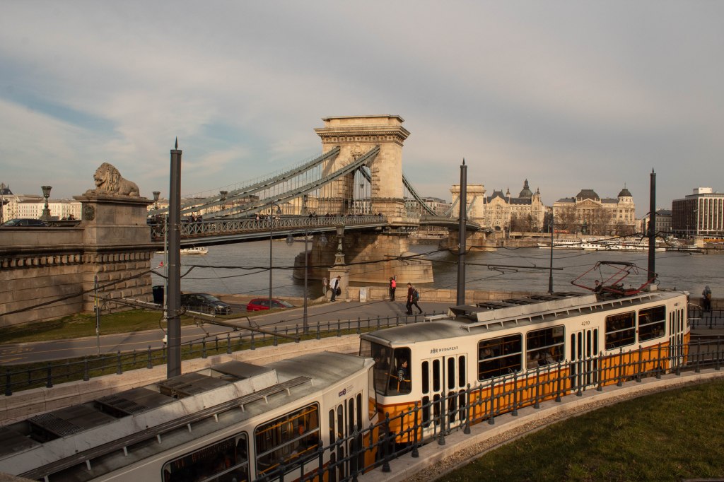
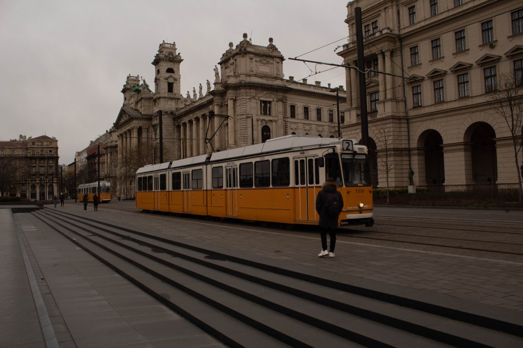
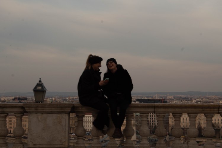
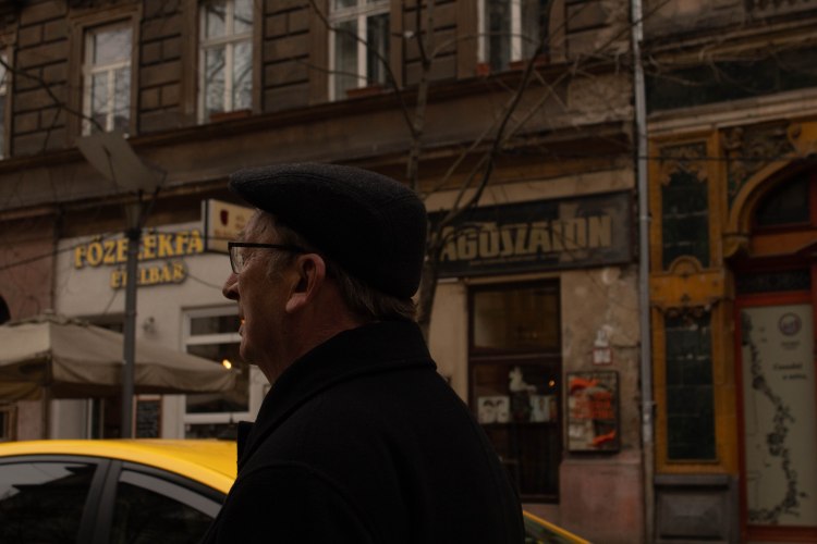
Street photography in Budapest was probably what I was must excited for. I enjoy street photography and being a tourist gives a bit of an excuse to be taking pictures of any and all ordinary things in public without people questioning my motives too much. I found it to be a great way of acquainting myself with the city, and observing the details.
STREET PHOTOGRAPHY: PEOPLE-FOCUSED
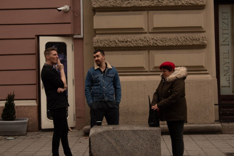
Shooting people in the street (with a camera!) is a great way to tell a story in a single frame. How the people look, what they are doing in that moment gives and insight into their life and suggests multiple things that could be going on. It was really refreshing to shoot new types of people with Budapest as the backdrop. There is something different to photographing strangers in a different country than the UK; it is from a different perspective of looking in at other people’s life, at a culture and location you’re not accustomed to.
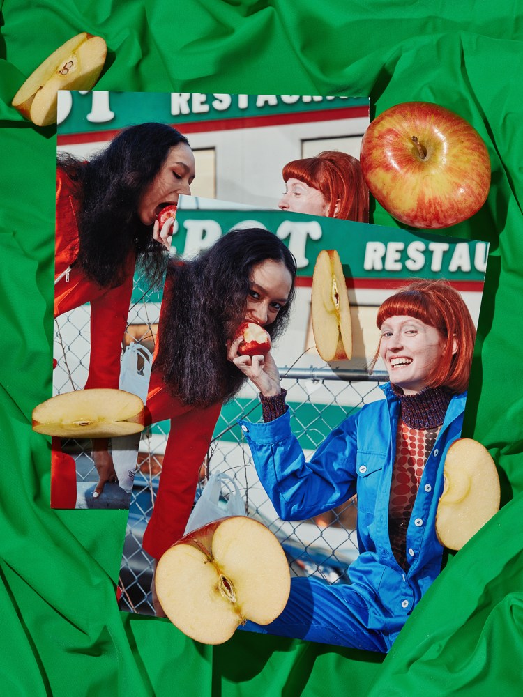
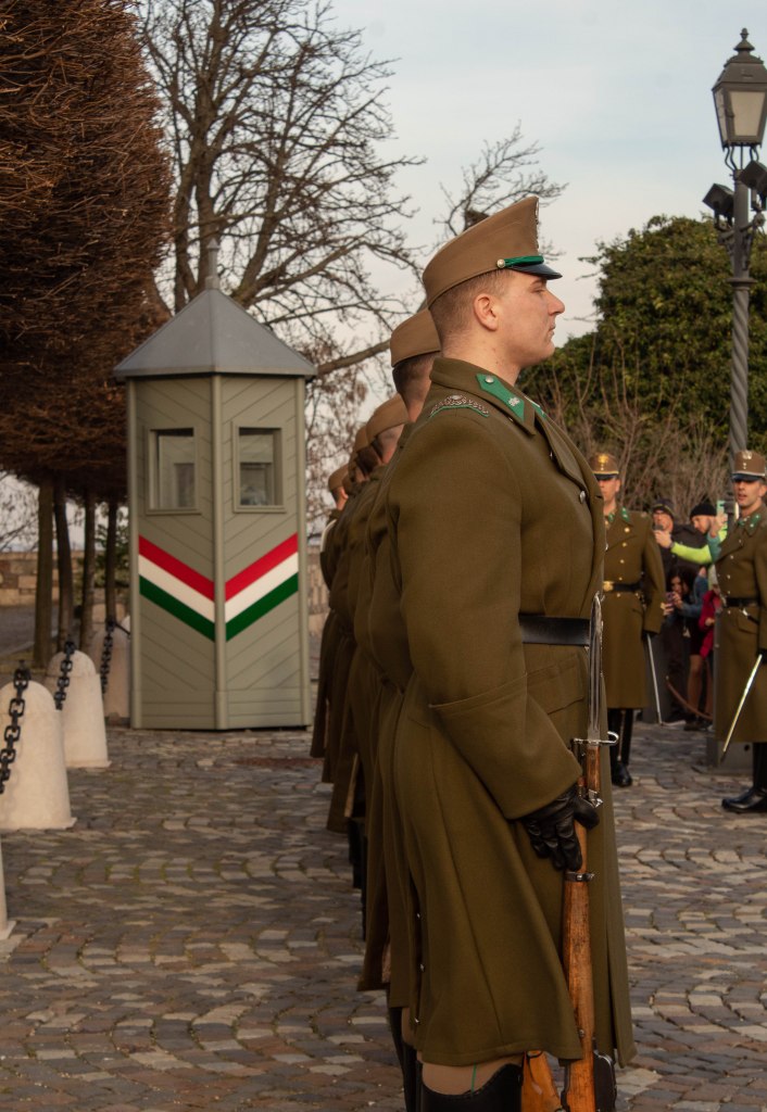
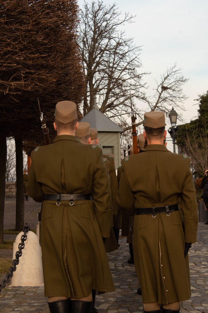
I liked shooting the soldiers outside the Hungarian Prime Minister‘s house (who I later found out is a bit of a scumbag but that’s neither here nor there). The soldiers are a bit of a spectacle for tourists so were used to being photographed, and I took full advantage of their orderly-ness for neat compositions. This really summed up the strong masculine culture still present in Hungary, that I saw and felt with the locals throughout the trip. While this isn’t necesarily always bad, it was definitely a culture shift and reminded me of the UK several years ago where there was a general stricter expectation for men to be super masculine. This showed through with some locals poking fun at me throughout the trip, which put me off asking local people to take their portait, as I wasn’t sure exactly how safe the environment was, and I didn’t want to put myself in a position that would’ve ruined my experience of the trip as a whole.
I really like my photograph of the restaurant workers on a break with the older lady in the red beret rummaging through her handbag (bottom right). All three of them had such a different energy, and the lady only stopped to look in her handbag, all of them sharing a space giving off such different vibes really entertains me. I wish I shot it better – the framing and focusing arent exactly right, but at least I have that moment captured.
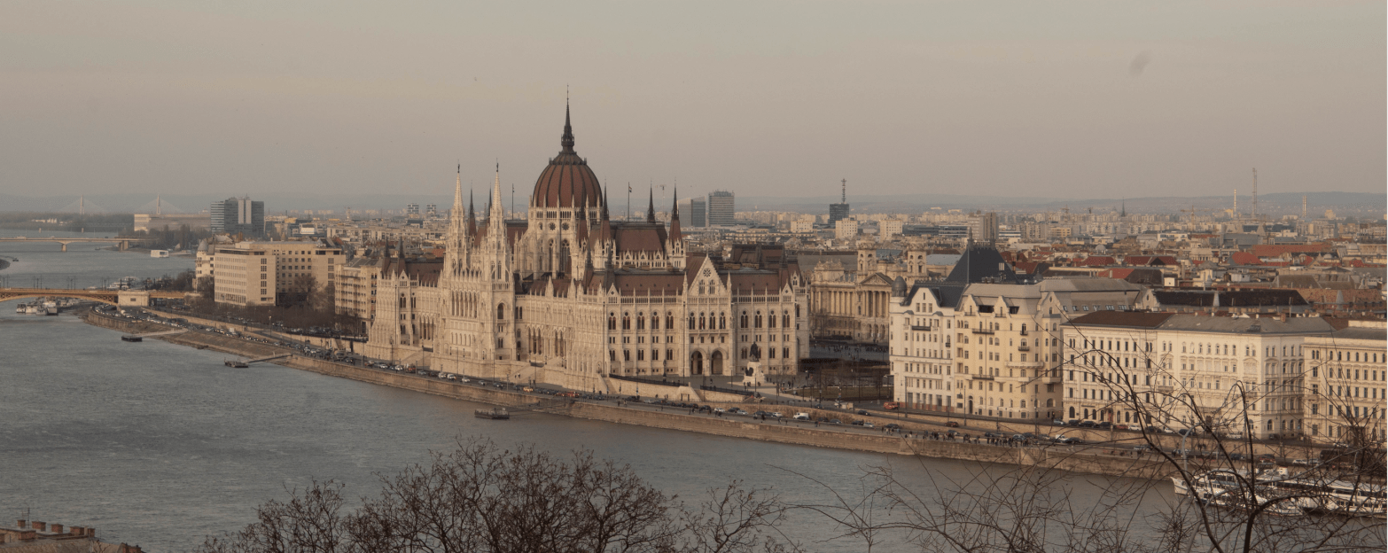
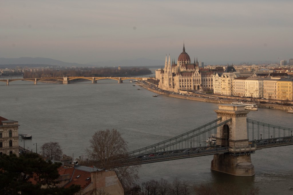
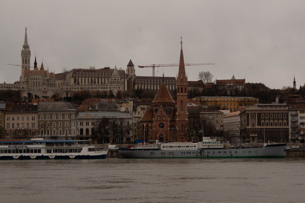
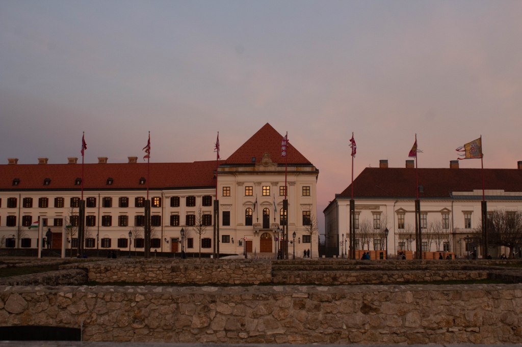
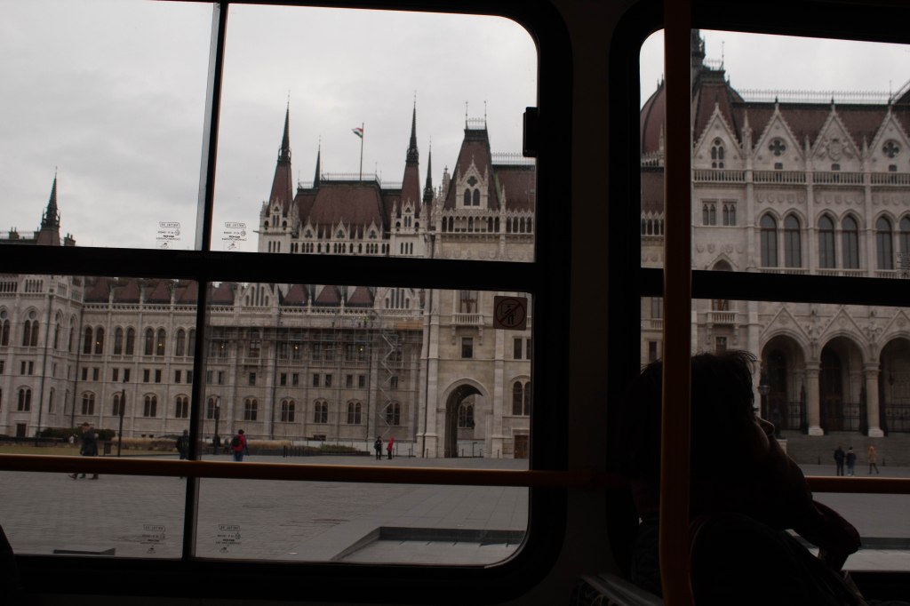
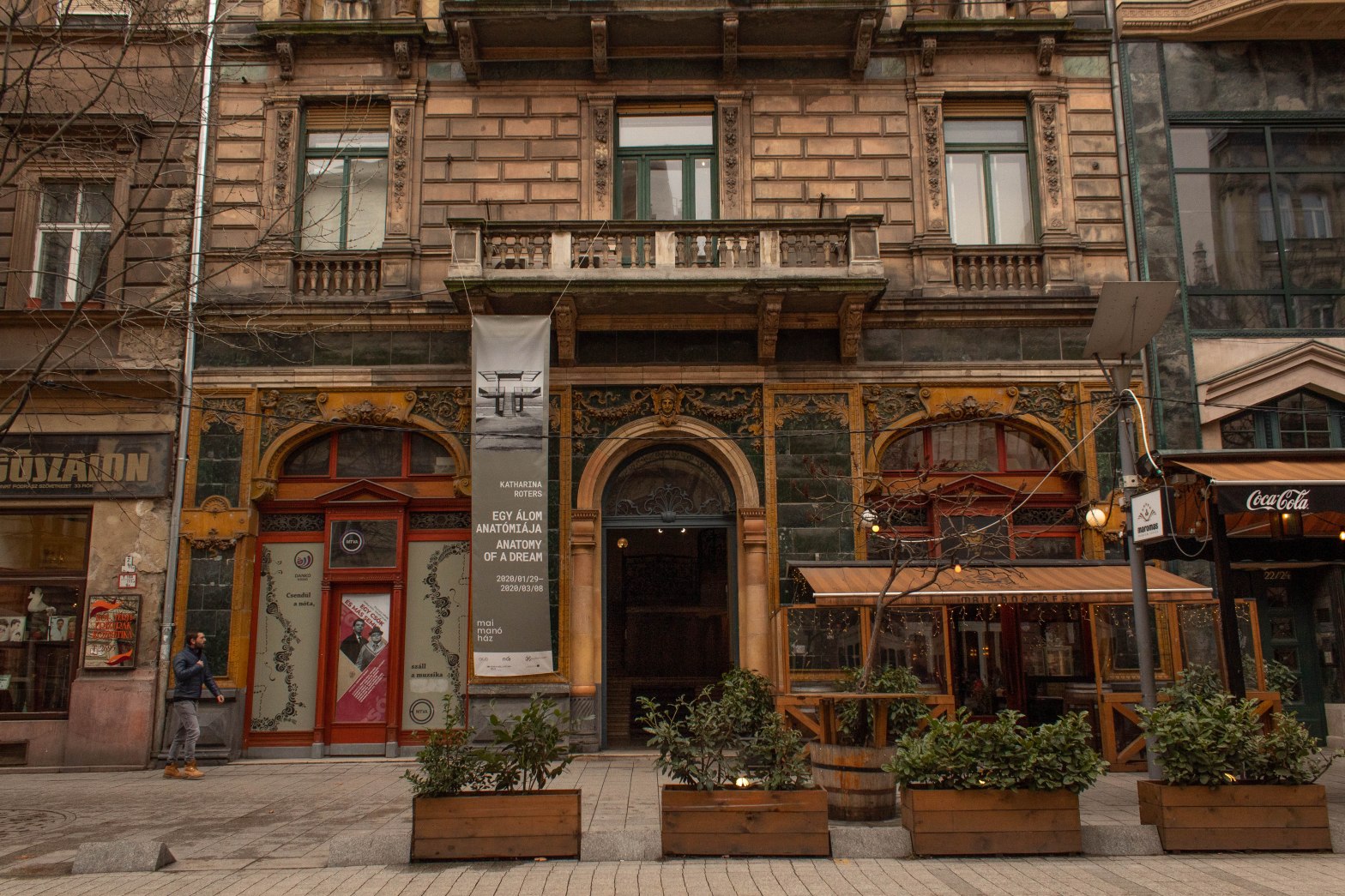
ARCHITECTURE
I loved the mixture and variety of architecture in Budapest. It reminded me of Manchester in that you could see the history of the city through the different eras of buildings; the Hungarian Parliament being the biggest and most powerful building with its majestic and imposing gothic elements of the structure, Buda Castle being one of the oldest wiht a mix of different styles throughout the ages. This is juxtaposed by the modernist buildings from the 1930s favoured by the middle classes in opposition to the state’s outdated style, as well as the cheap and dull 1960s/70s residential apartments.
PORTRAITS
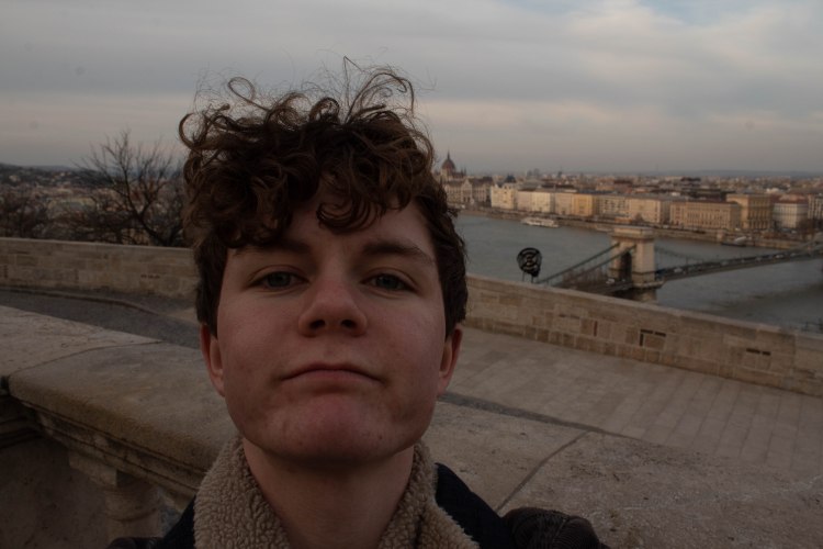
cheeky selfie 👀
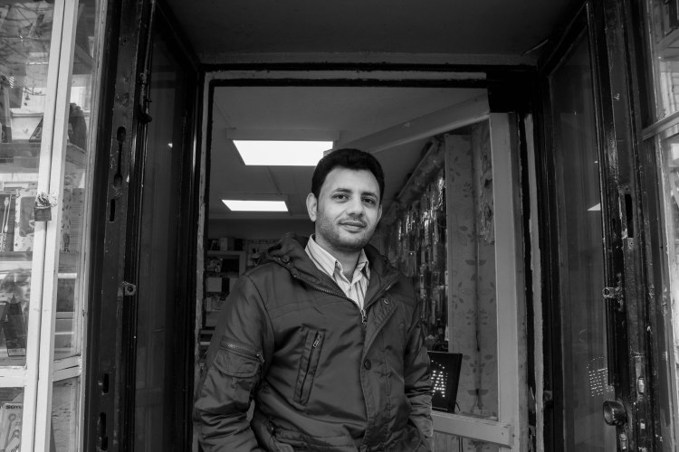
My biggest regret from the Budapest trip was the lack of portraits I took. I had wanted to push myself to approach strangers for portraits, as it is usually more accepted when you are a tourist and I thought this would be a good step to building my confidence. But it was easier said than done and I kept talking myself out of it, which I am kicking myself for doing. I did take this convenience store owner’s photo, but this was mostly prompted by him starting a conversation; asking if we were students, where we were from. He was friendly and this made it much easier for me to ask to take his picture. I stayed and spoke to him briefly (regrettably I’ve long forgotten his name), I think I would have spoke with him longer and asked to take more photos if it weren’t for time constraints and sticking with the group.
the shoes on the Danube bank
The Shoes on the Danube Bank is a really emotional installation. It is a memorial for 3500 people (mostly Jews) who were forced to take off their shoes then were shot by facist Arrow Cross military on the river bank so their bodies fell into the river, during world war two. Knowing what had happened to these innocent people while standing where they were shot, looking out across the river was very moving. It felt more effective at communicating loss by showing what would have been left of them (their shoes) rather than sculpting the people themselves.
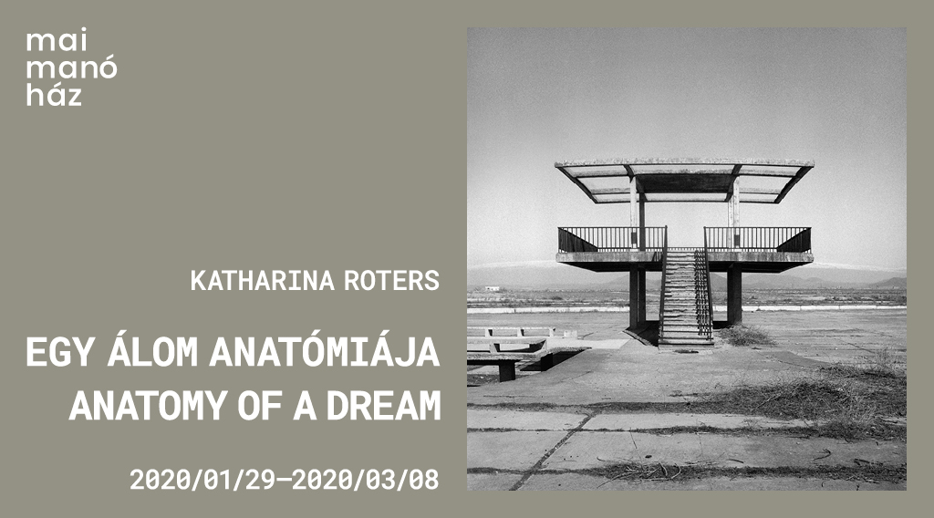
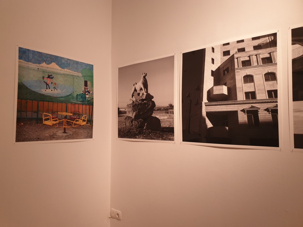
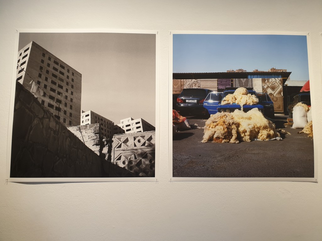
ANATOMY OF A DREAM: ARCHITECTURAL PHANTASMS AND URBAN UTOPIAE IN ARMENIA
YEREVAN|METSAMOR: THE ARMENIAN ATOMIC CITY|UTOPIA AND COLLAPSE
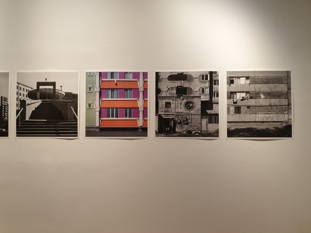
I really like Katharina Roters’ visual style; how she frames the lines and shapes within the frame, making entertaining images out of documenting derelict parts of cities.
Her photographs are quite sad and show a potential that never came to be. The bold and colourful buildings left abandoned resonated with me. There was an attempt at a better way of life that never happened due to greed and nuclear disaster.
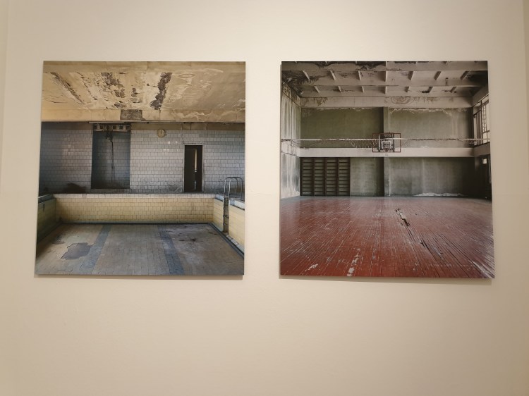
HOUSE OF CULTURE
This section of the exhibition was in the last room and it brought all the previous themes together in a simplified example of the plans for improvement in the community which were abandoned and never carried through. The bare bones of the House of Culture hold so much potential as a place for the community and its really depressing to see it so derelict and empty.
I really liked this exhibition and how Roters was able to tell a story about a big subject at such a close perspective. I like that just by showing evidence of human activity without showing people it was still just as effective at showing the effect it had on the population.
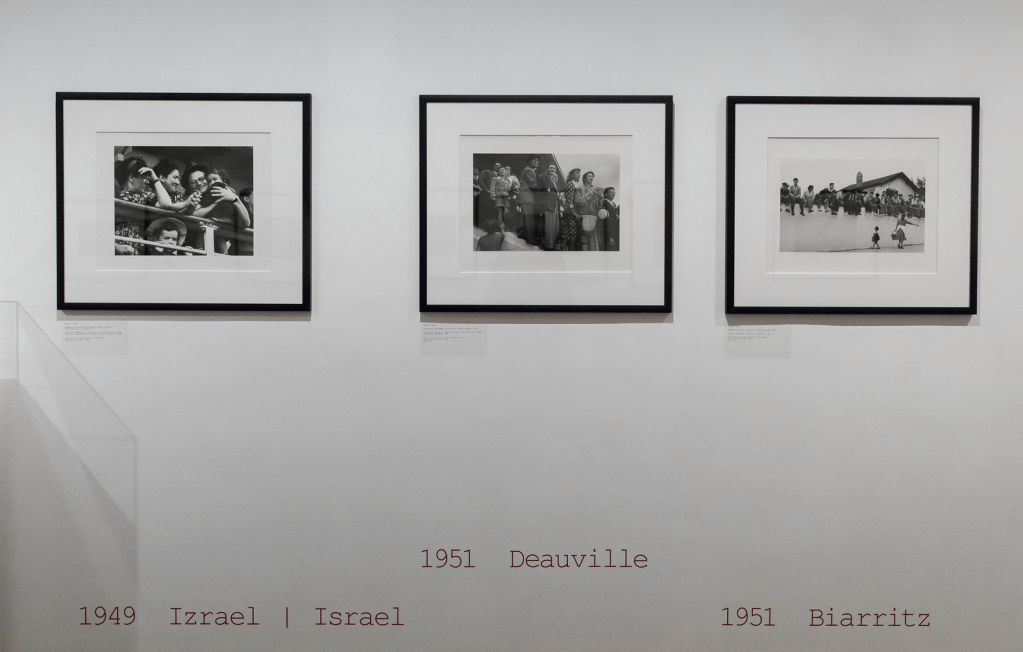
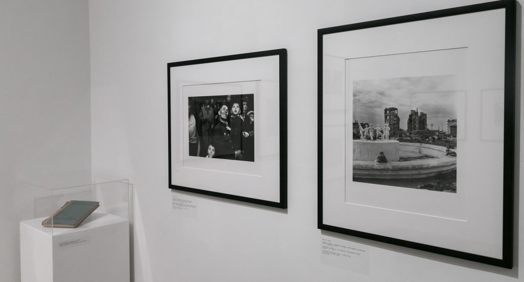
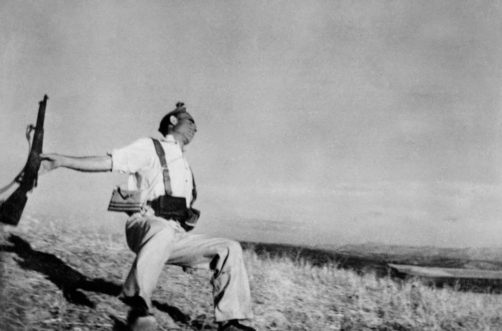
I recognised some of Robert Capa’s iconic photographs but had never known the name of the photographer. I find his photographs very moving and like a window to that moment in time, especially paired with the context of the time and place. His photographs put faces and emotions to the wartimes he photographed. It was amazing to see the photographs leading up to and after his more iconic photographs, showing the effectiveness of narrative flow in a series of photographs.
As someone interested in pursuing photojournalism or documentary photography, I found this work awe-inspiring and motivating to capture moments in time to communicate a story and reflect reality, while considering creative elements such as composition.
PÉCSI JÓZSEF PHOTOGRAPHY GRANT 2019
KATA GEIBL – ‘THERE IS NOTHING NEW UNDER THE SUN’
I love this work by Kata Geibl. Her images are composed and lit beautifully in natural light. There is a calm stillness to this series; you can almost feel the textures and atmosphere, and all the visuals are comfortingly familiar to me in an unexplainable way. The title of this work ‘There is Nothing New Under the Sun’ explains Geibl’s possible motivation to create tactile and familiar images that most people could identify with in some way to express the opinion that nothing new can be created.
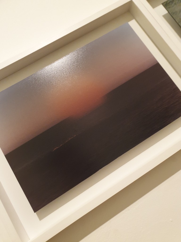
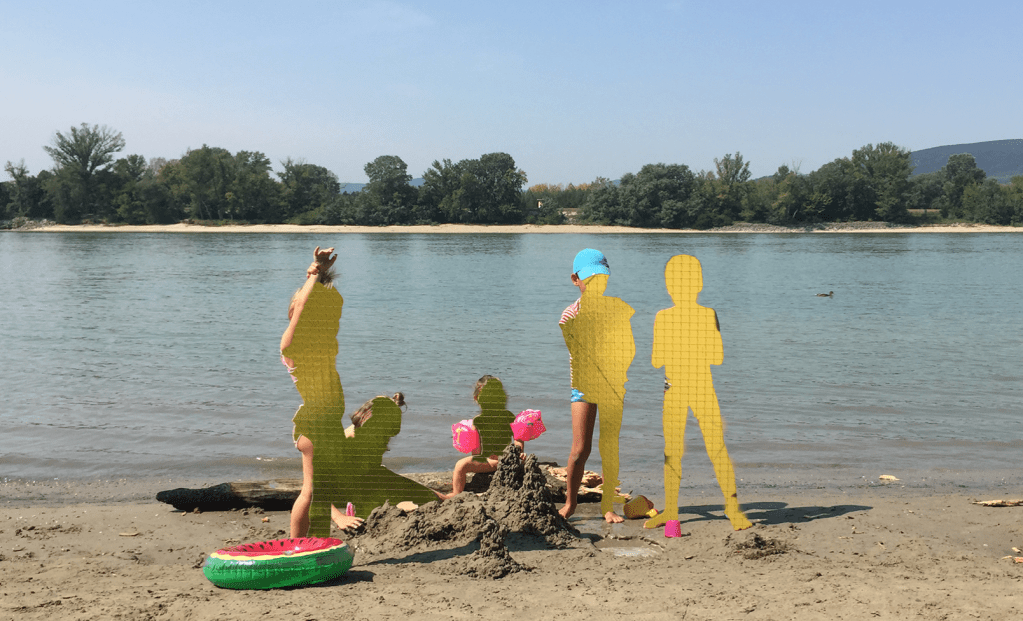
SÁRA ZAGYVAI – ‘SANDBOXES’
These experimental images from Sára Zagyvai really interest me, because I haven’t seen technique like this before. I am intrigued with how she made the soft sunset image, as it didn’t look natural in physical print. And I’d like to try the method of cutting out figures in a large physical print and filling them with a background, its really visually interesting and prompts a lot of questions. When I first looked at it I thought it was blank cardboard cut outs propped up in the sand – which would also make a weird image.
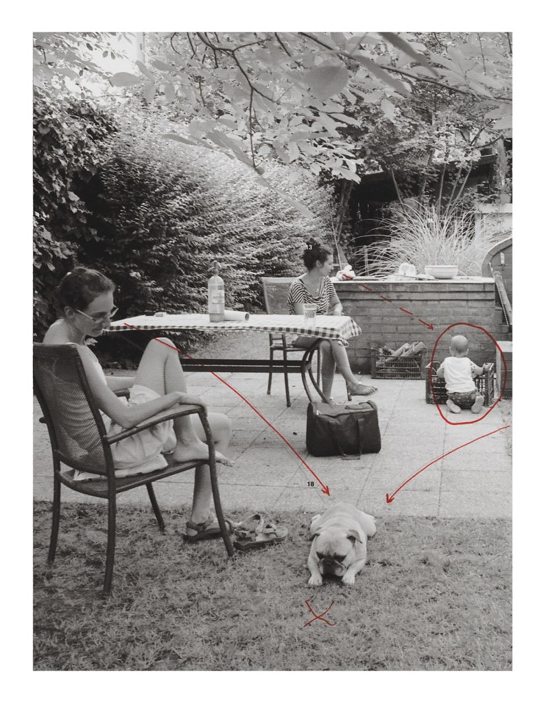
JÚLIA STANDOVÁR – ‘detail 02’
Marking out the eye line of where everyone in frame is looking, done similar to how you would on a contact sheet, adds an interesting element to an otherwise ordinary photograph.
I like this extra layer of pen drawing or writing Standovár has in some of her pieces which invites the viewer to look closer into the details of the image by following these arrows and circles.]
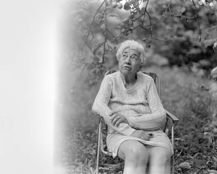
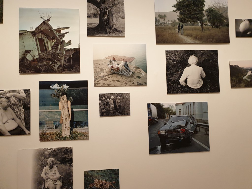
BALÁZS TURÓS – ‘CLOSER’
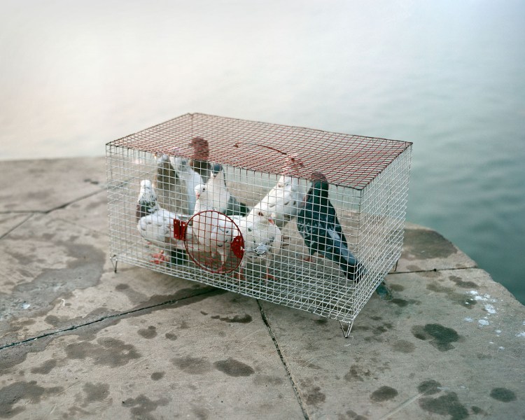
I think this series is absolutely beautiful. Aesthetically speaking they are very gentle images, some with contemplative atmospheres, mixed with tense and retrospective images. I particulary felt this with the photograph of the pigeons in a cage close to the water’s edge; the colours are pale and soft and the pigeons appear calm. However them being so close to the edge while trapped in a cage makes me feel tense because they could easily be knocked into the water and drown, but there is no other visual language to make the viewer feel this way.
Upon researching this series I found Turós intended this work as an exploration of asking if death becomes less scary as you get older. This explains the mix of calm, whimsical photographs of his grandmother, and the sad and slightly disturbing images of the damaged car, or the abandoned house falling apart.
Elderly people usually seem more comfortable and accepting of death, in a retrospective state of mind, and I think Turós communicates this feeling well through his photographs. His other photographs (usually the ones in colour) hint at a sadness and fear of death, as if from the distant perspective of those affected by the death of a loved one; the photos feel unexplainably lonely, mournful and apprehensive.
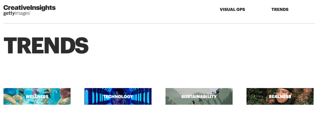
Getty supplies licences for stock and editorial images for creative campaigns. Getty gives 5% commission to the photographer of every image they sell to companies/organisations. Visit Getty Images Custom solutions for briefs. Visit Creative Insights – Trends to see the latest visual trends, what appeals to consumers and the latest contemporary artists.
It is important to be aware of contemporary practises and visual culture in the photo industry. The impact of contemporary creative practices will make you more aware of the wider industrial context. Important to understand visual trends for clients.