
[07/02/2020]
PHOTOBOOKS & MAGAZINES
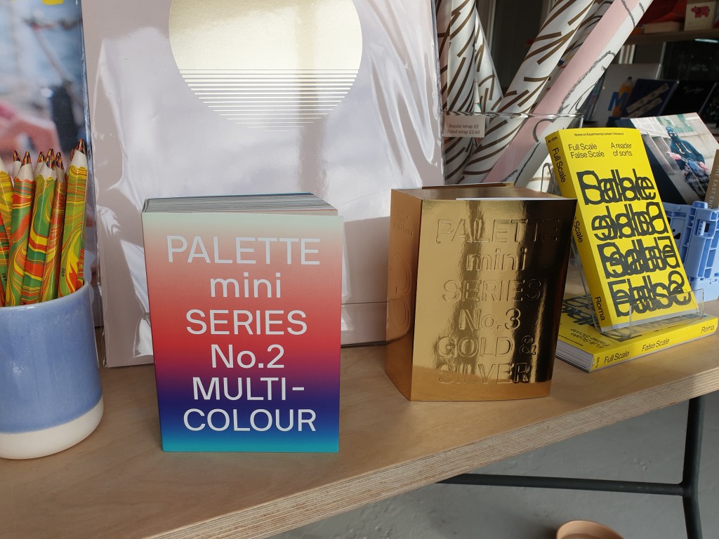


The PALETTE mini SERIES books are fantastic for visual and conceptual inspiration; small size but with hundreds of pages of timeless conceptual images categorised by colour style. I like the shiny reflective gold cover of PALETTE mini SERIES ‘No.3 GOLD & SILVER’ with the title etched into the cover, it really stands out against all the other books.
I’m a big fan of Luke Stephenson’s ‘THE ENGLISH ROSE’ series, his photographs are a beautiful, bold yet simple representation of the iconic English rose. The purpose of this series is to celebrate the beauty and diversity of English roses, therefore the images are almost purely driven by an appealing visual aesthetic; only showing roses in their prime without imperfections. The high level of detail just makes you want to study these stunning images for hours.
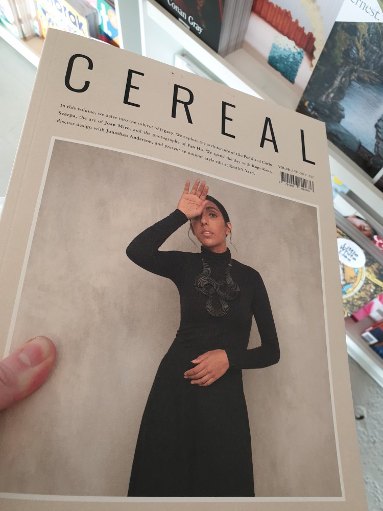

I really liked the paper texture of the photo book ‘CEREAL’ the volume looking at the theme of “legacy”, showcasing several creatives work. The matte paper was thick but malleable. It kept a strong aesthetic vibe and colour palette, and I liked that it was mostly visual, the images filled the pages without a border, with text small and sparse.
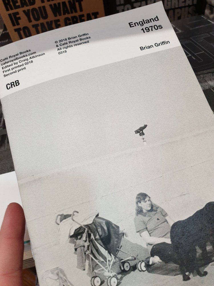
What drew me to ‘England 1970s’ by Brian Griffin was the simplicity of the typeface and that when open the front cover and back cover is a whole complete photograph. I think having the title, photographer, publisher and other info plainly laid out on the front cover is really well suited to the style of photography within the photo book (street & documentary). It is all about the content of the photographs themselves, and the style of the book as a whole reflects the 1970s.
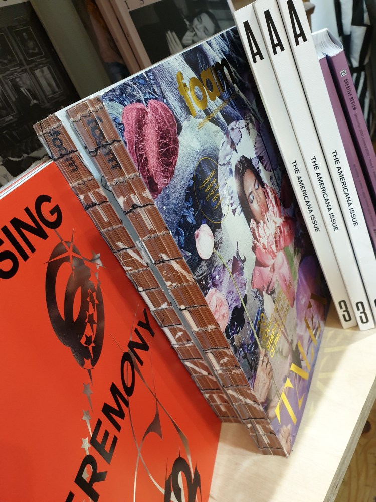
I love the exposed binding of the ‘TALENT’ edition of FOAM MAGAZINE. The frayed and pieced together appearance reflects the textures and aesthetic of the photographs featured, especially the front cover image. I think this type of binding is very individualistic and I haven’t seen a book bound like that before. I like that you can see the sewn binding inside the fold of the pages too, adding to the homemade appearance which makes it feel more “special” and less associated with mass-produced magazines.
